
Context.
Autism360 is a start-up, who offer parents and carers an advanced digital therapeutic platform to support Autistic children in their care. They provide expert therapist content in the form of self-paced courses, face-to-face real-time therapist online consultations, resources, and community support.
I joined a small in-house product team as their first official UX Designer. My main task was to conduct a User Experience (UX) audit for the Autism360 app on Android and iOS devices, as well as work on a backlog of design tasks by collaborating with stakeholders, senior React development engineers, test engineers, and other colleagues.

ux workshop.
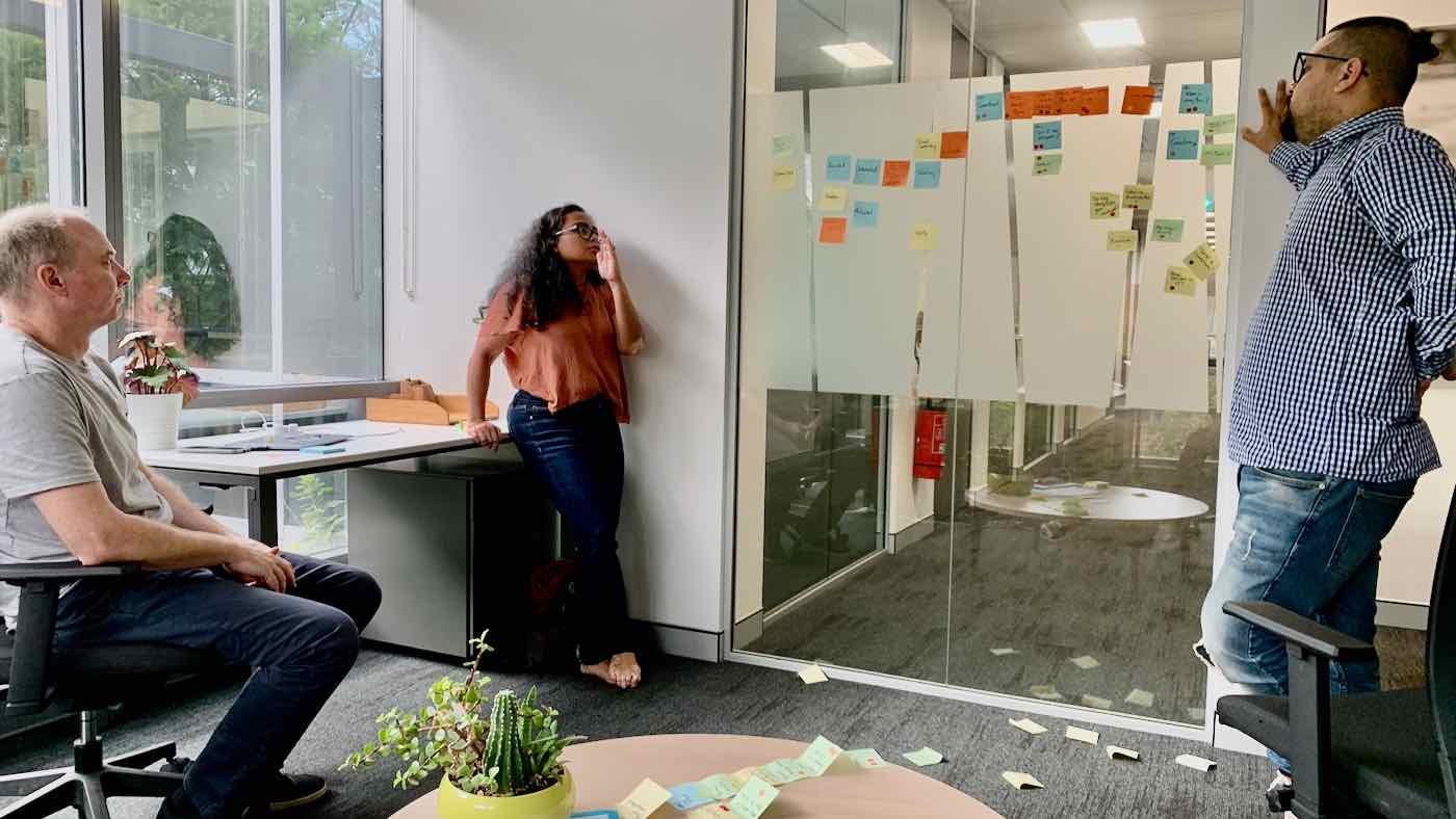
To kick things off, I held a face-to-face UX workshop with 3 key decision-makers: the CEO, the CTO (Chief Technology Officer), and the COO (Chief Operations Officer).
During the UX workshop, I facilitated discussions to understand what users’ experience with Autism360 should be. We brainstormed how users should feel, what they should learn, and what they should understand about the product. I also empowered stakeholders to pinpoint areas needing the most work and helped them prioritise those topics.
Over lunch, I took a productive step in organising the valuable information gathered in the morning session. I facilitated a card sorting exercise after lunch, where we categorised key findings under three main themes: User Needs, Company Goals, and Design Considerations.
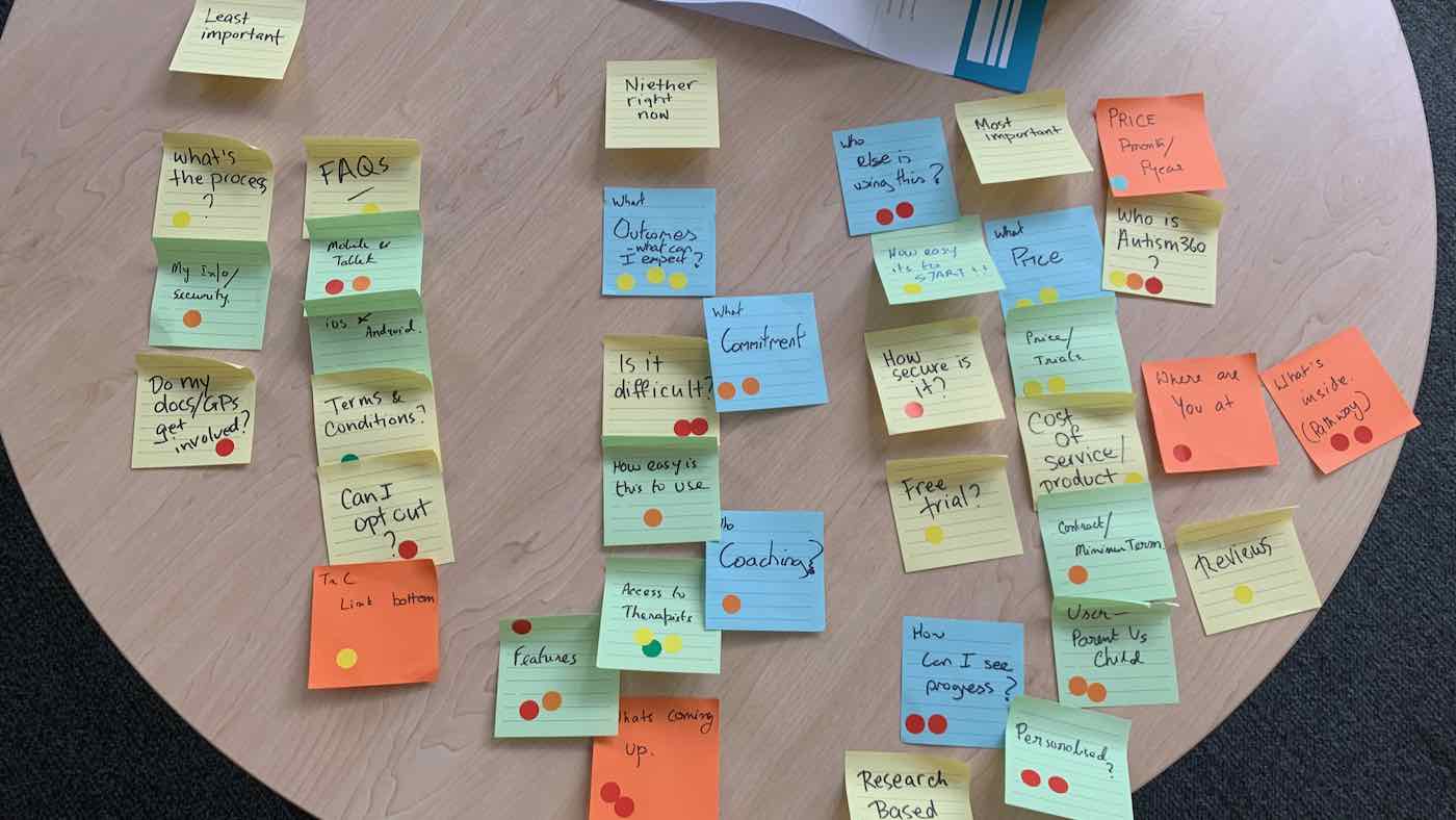
This insightful exercise helped us identify the most critical aspects within each category:
- User Needs: Users expressed a strong desire to understand their child’s developmental journey and progress within the app. There was also a clear interest in accessing Autism360 user reviews to gain further insights.
- Company Goals: Prioritising clear communication about Autism360’s mission, research-backed approach, and reputation was paramount to the team.
- Design Considerations: Personalisation for each unique child’s needs, robust security, user-friendly interface, and a clear trial and pricing structure emerged as key design considerations.
Building upon this momentum, I then created user statements based on our earlier discussions. This allowed stakeholders to actively participate by placing these statements under the relevant issues they addressed.


a better user flow scenario.
Reflecting on the user needs identified earlier, I helped them prioritise how users could get started quicker on their mobile application. The flow below begins from a Welcome to Autism360 email. This email is automatically sent after a user purchases a subscription via the app (for new users) OR by the website.

To further deepen our understanding of Autism360 users, I facilitated a follow-up online workshop using Zoom. This interactive session involved an empathy mapping exercise. Through this activity, we explored various user aspects: what users say, think, do, and feel.
identifying the current ux.
Due to limited time and business expenditure on formal User Experience testing of Autism360’s app, I explored the application myself. I was eager to understand the user experience firsthand, so dived into the Autism360 app.
My mission: to replicate the steps a typical user would take, from initial sign-up to navigating the app’s features.
To ensure a comprehensive perspective, I explored the app on two platforms:
- My personal iPhone: This allowed me to experience the app in its intended release state, just as any user would download it from the App Store.
- TestFlight: This platform, designed for pre-release testing, provided a valuable glimpse into the app’s functionality before its official launch.
By using both environments, I could identify any potential discrepancies between the development and final user experience.
The following screenshots taken at the time of testing needed UX improvements:
- Login, Purchase and Success
- Landing screens for Home/Courses, Program, Sessions, Workshop (not pictured), Resources.


ideation & prototyping.
During a later online presentation, I focused on strengthening the connection between the Autism360 brand identity and the app’s design aesthetic. I showcased a mood board that visually represented this concept.
Additionally, I proposed illustrative UI designs with the goal of achieving wider user appeal. These designs prioritised a balance between modern sensibilities and enduring relevance, ensuring they stay visually current for an extended period. This was particularly important as a soft marketing launch was immanent which would expand their product to markets in the USA, UK, IRE, Canada, Singapore, and Malaysia.
Encouraged by the CEO’s positive feedback on the design direction, I began developing wireframes to explore improved app functionality and clarity.
I proposed an iterative improvement process, focusing on backlog refinement, and a completely redesigned user experience in tandem. This new UX would prioritise a balanced visual hierarchy, enhancing user appeal while simultaneously strengthening the Autism360 brand identity and offering.
some high fidelity concepts.


Result.
While my time at Autism360 came to an end due to unforeseen circumstances, I’m honoured to have had the opportunity to contribute these design ideas and concepts to a notable service that supports the disability sector and their carers.
Despite the designs not being implemented in the latest iOS or Android app iteration, they remain valuable assets within Autism360’s design repository.


Related Projects.