Description.
My Muscle Chef is all about offering smart nutrition that enables one to feel their best. They pair high-quality meals with exceptional taste with the ultimate convenience and ease, allowing one to focus on their holistic health needs and fitness goals.
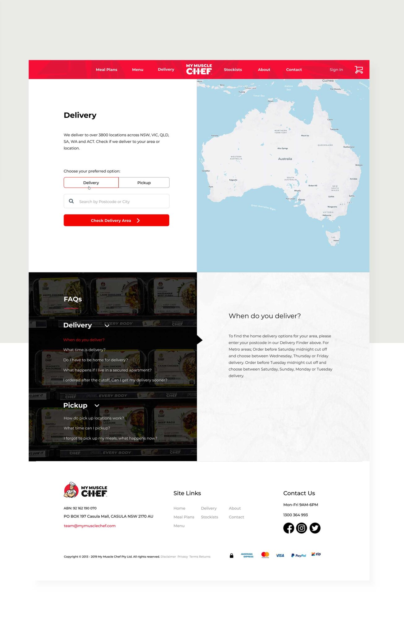
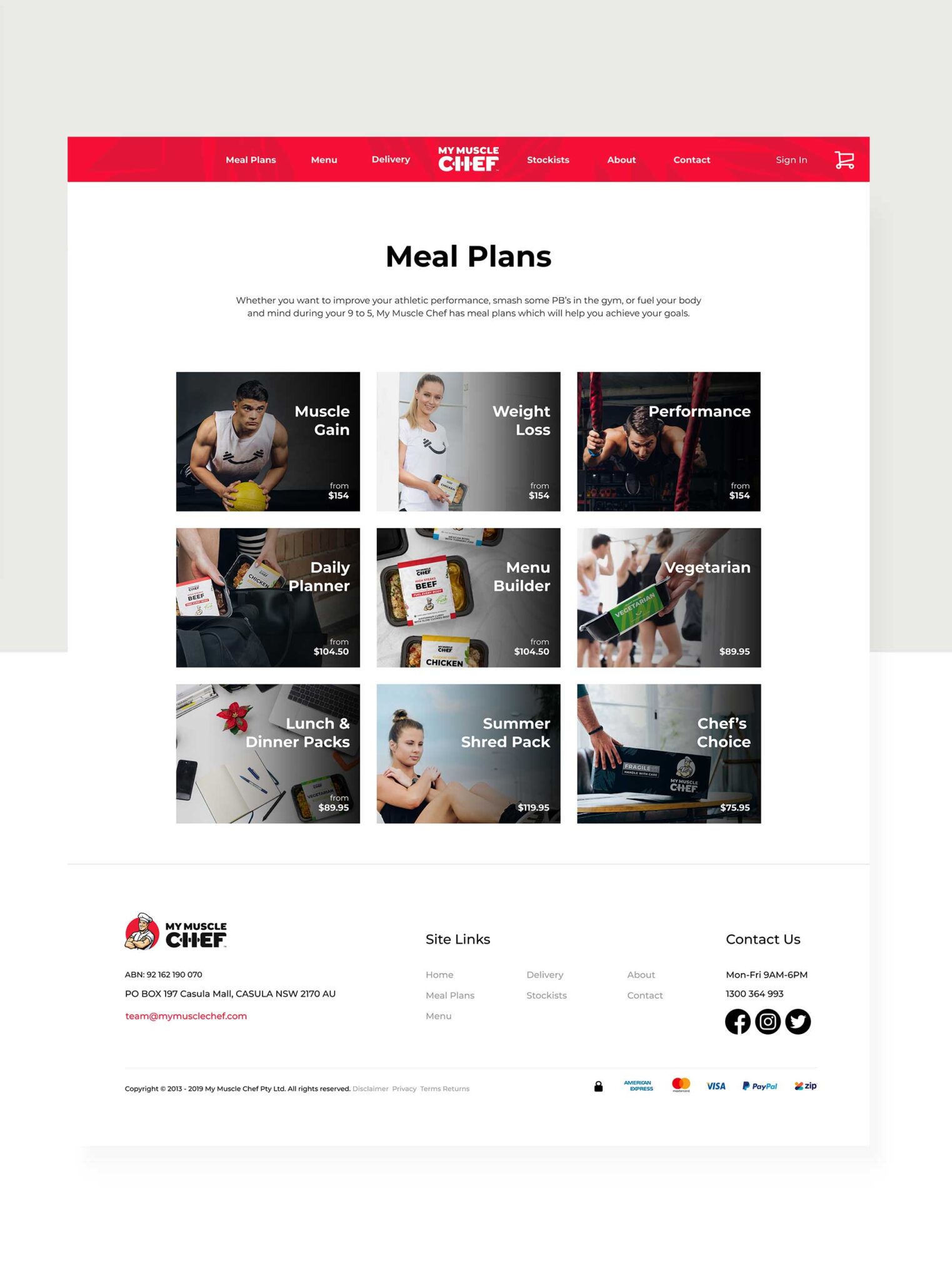
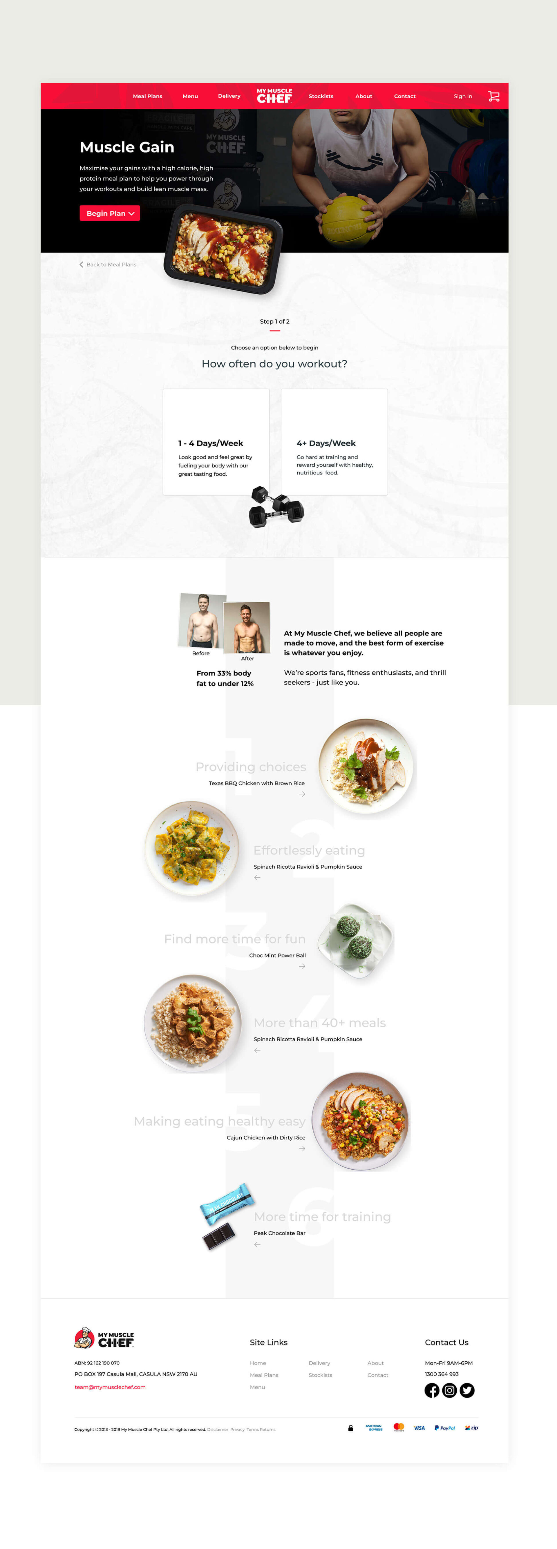
In September 2018, I was appointed as their first UX/UI Designer to improve their website user experience for guests and existing customers interested in My Muscle Chef.


Brief & Idea.
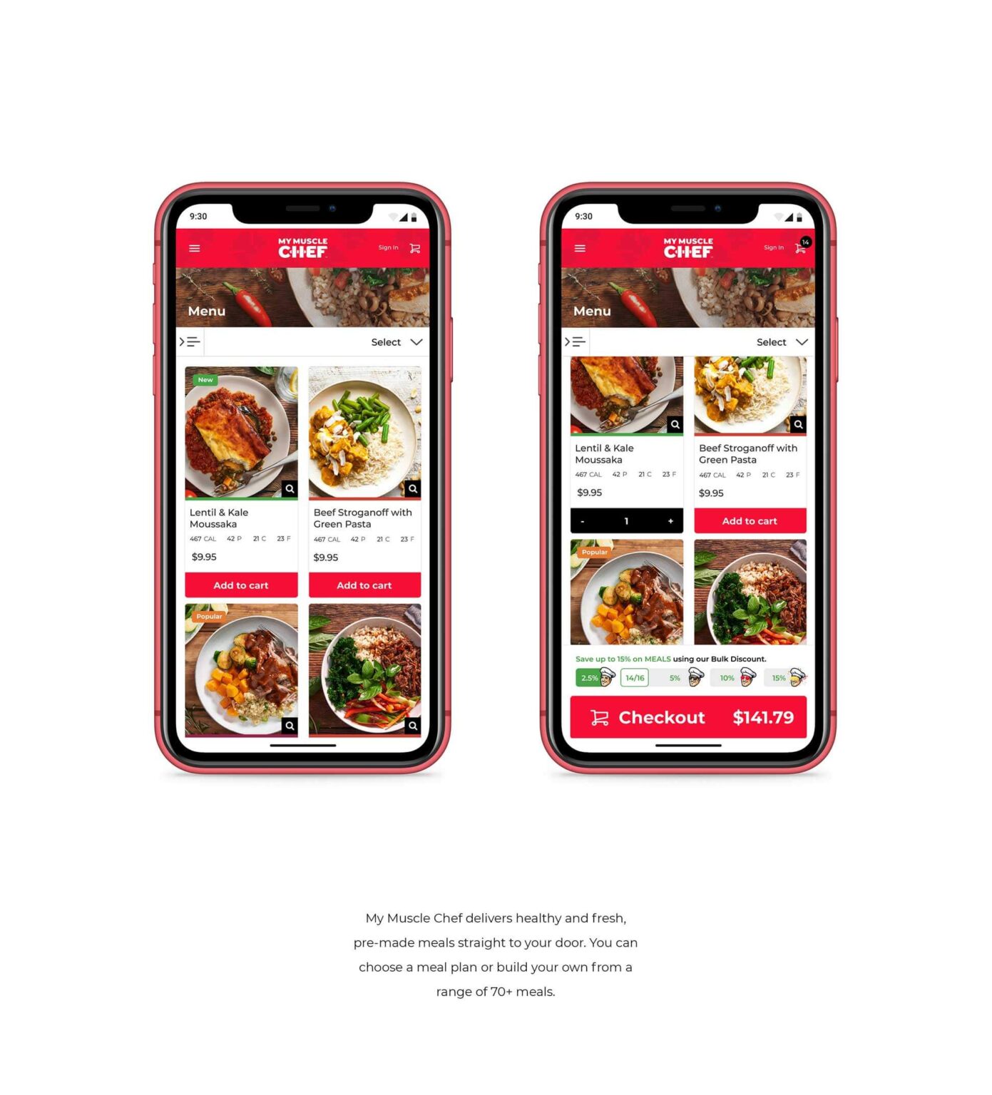
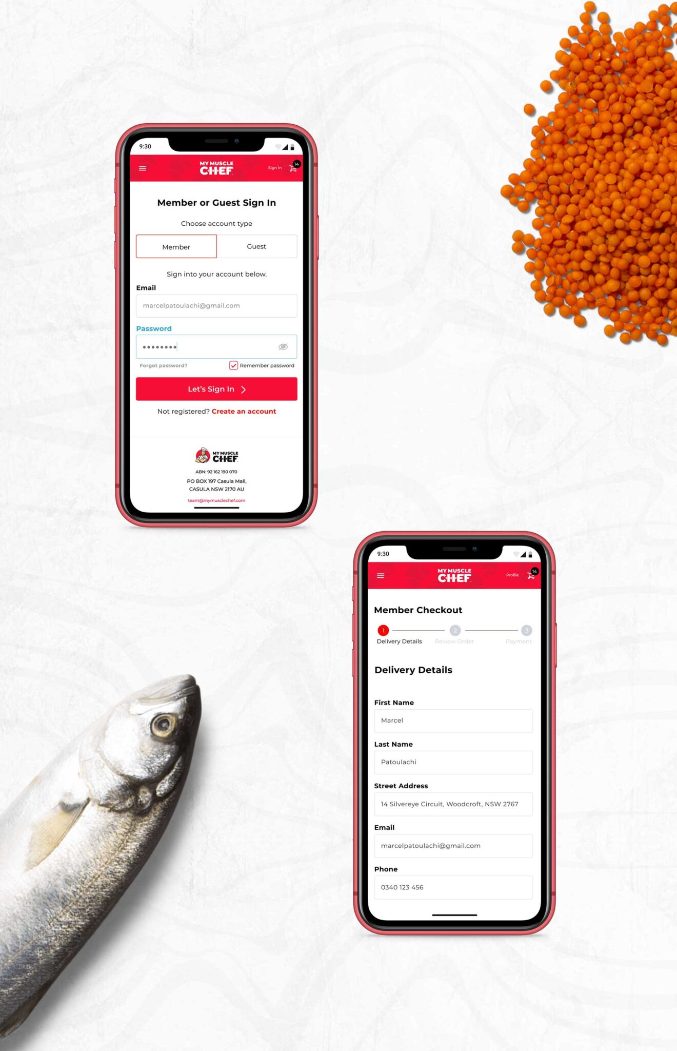
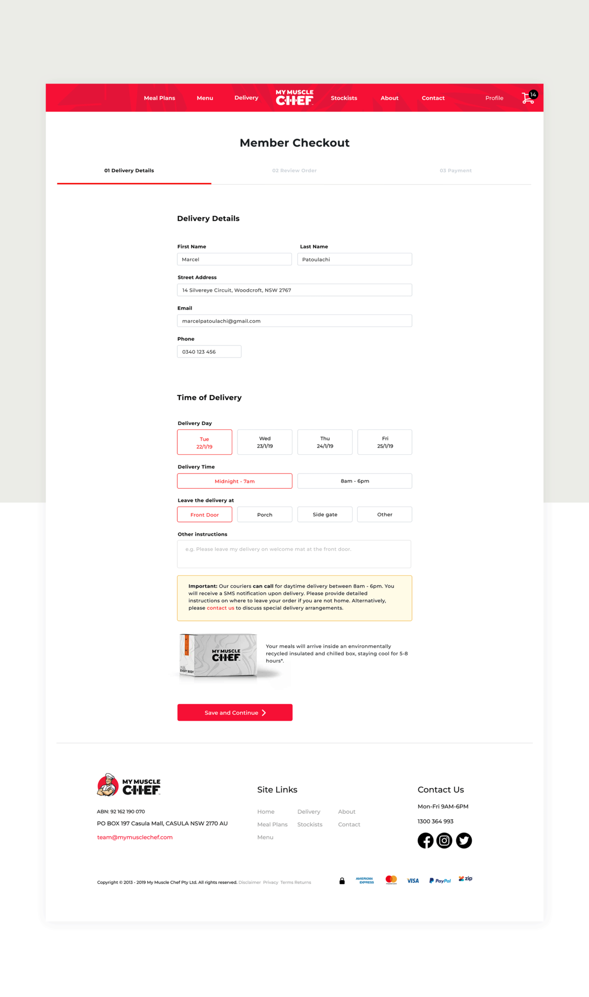
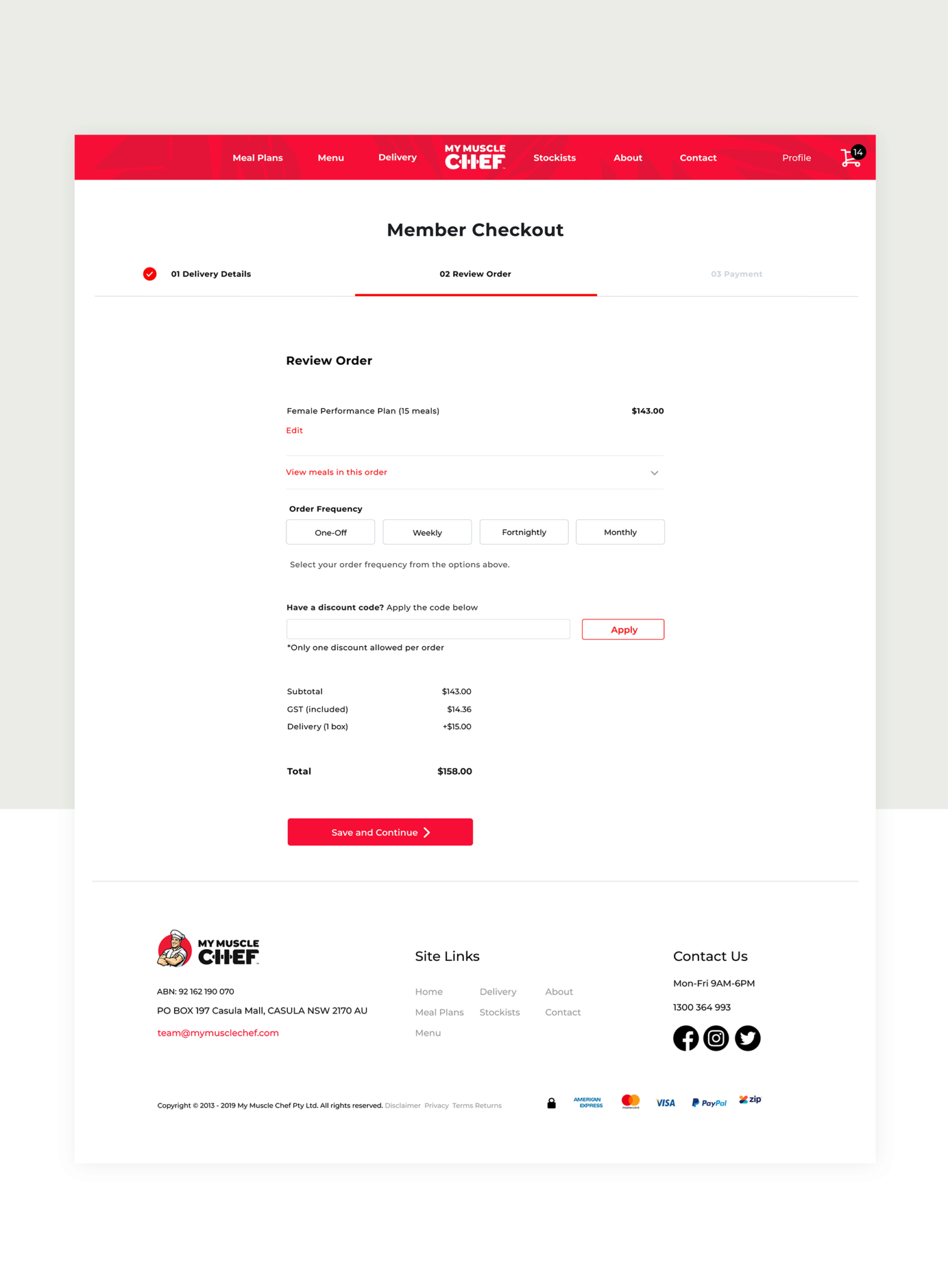
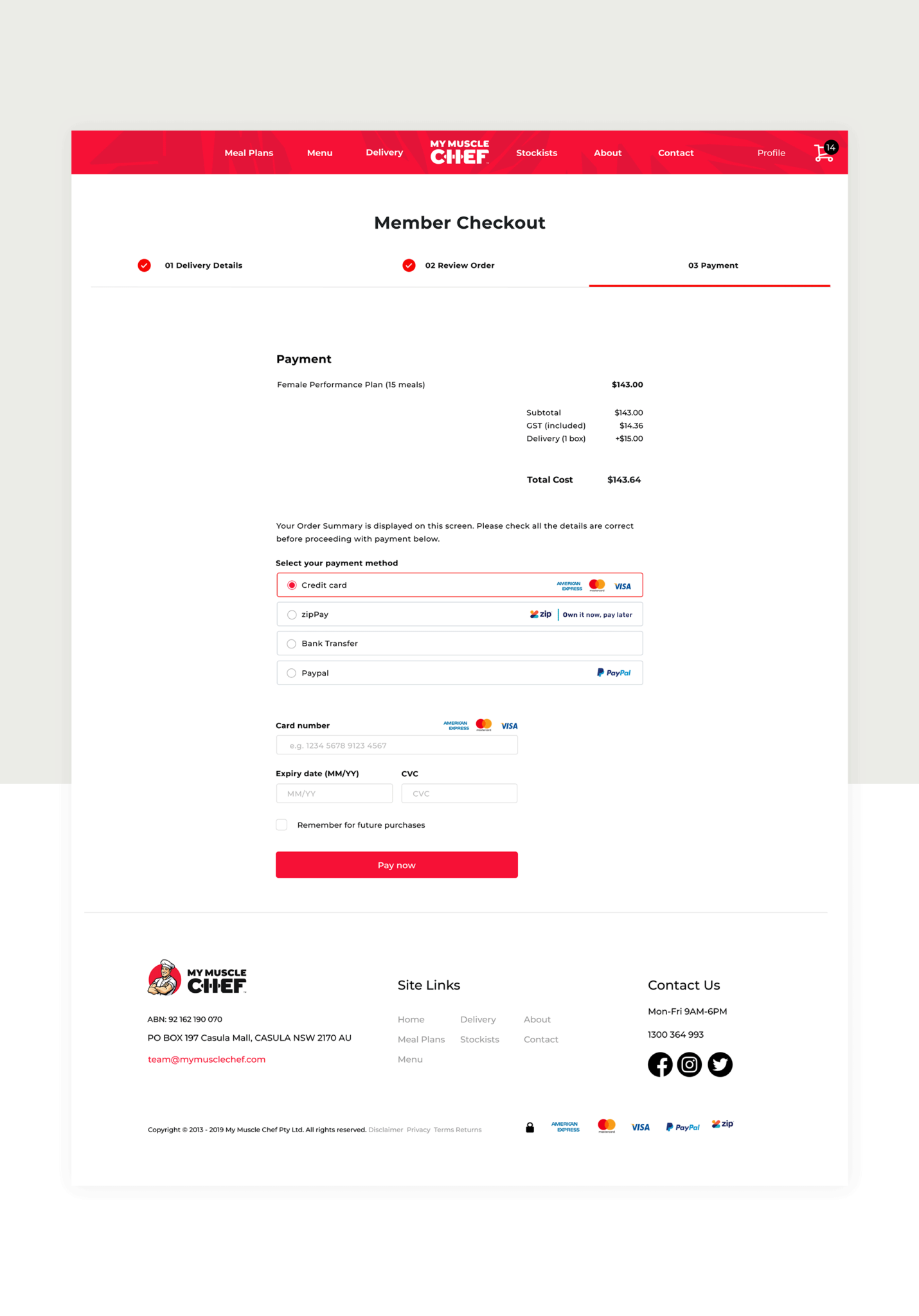
I worked on a range of design projects, but none as important as improving the checkout purchasing experience which they noticed had a drop in sales, particularly on mobile.
To optimise the checkout funnel for any quick front-end fixes, I used a combination of self user testing methods, and analysis of Google Analytics real-time data. By observing the real users and testing the payment funnel, I uncovered immediate pain points and gathered valuable insights.
With the immediate problematic issues, I worked with the Chief Technical Officer to remedy them as soon as possible before embarking on a brand new UX experience.
I then underwent a large scale UX review, refining the UX purchasing steps and processes to maximise conversions, ultimately improving the UX.
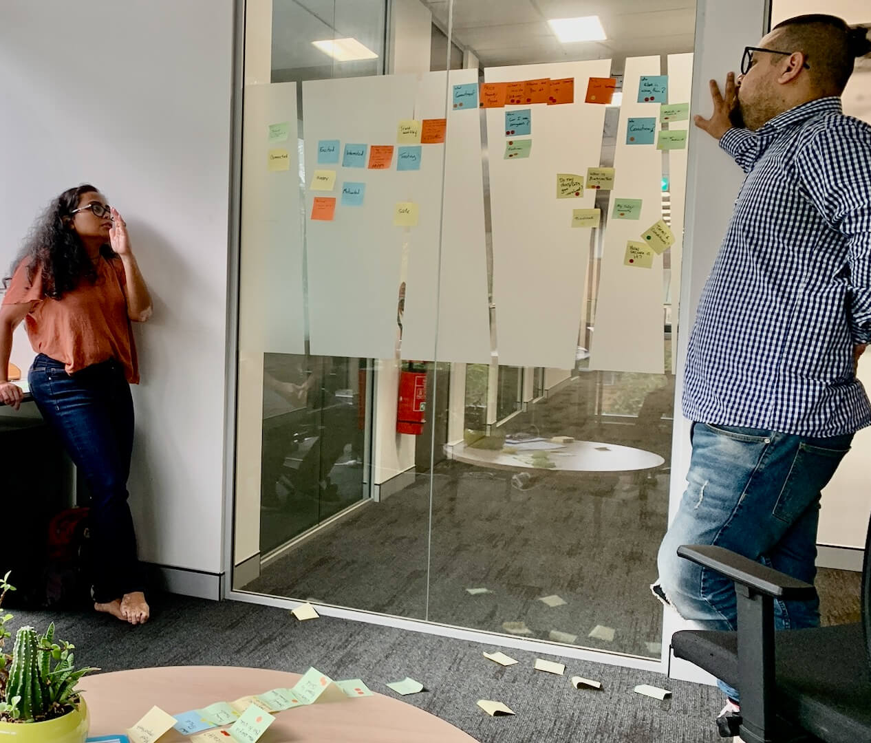
I created UX customer research questions, meticulously crafted to uncover user behaviours, preferences, and pain points, providing valuable insights that informed design decisions and drive meaningful improvements.
Collaborating with the Customer Success team in answering these research questions ensured a holistic approach to UX. By leveraging the direct customer insights and feedback, I optimised user experiences, increased satisfaction, and drove long-term customer success.
Result.
Creating a successful checkout funnel involved a careful balance of simplicity, trust, and efficiency. In streamlining design feedback from the team and stakeholders, I also implemented new ways of working by using Sketch cloud as a means of providing team comments and instant access to UX and UI designs.
Through user research, iterative design, rigorous prototype testing, and collaboration with My Muscle Chef’s key stakeholders, we created a brand new robust UX journey.
We streamlined the purchasing process, minimised friction, and enhanced conversion rates, resulting in a seamless and delightful checkout experience for customers, driving business growth.
Conversion rate success was achieved by understanding user behaviour, optimising the user journey, and implementing persuasive design elements and language.


