Healius: Intuitive Enterprise Healthcare
End-to-End Application
Enterprise Platform
Project Overview
As the sole Australian-based UX/UI Designer at Neuronimbus, I served as a primary design lead for Healius, one of Australia’s leading healthcare services providers.
This role required balancing high-level strategic governance with hands-on product design to support a massive network of clinical professionals and patients. The focus was on modernising legacy systems and creating intuitive digital tools that simplify complex medical workflows.
Timeframe
2023 – 2024
My Role
UX + UI Design, Visual Design, Design Systems Governance, Interaction Design, User Research, Prototyping & Testing
Tools
Figma, FigJam, Zoom
The Challenge
Bridging the gap between clinical complexity and user-centric design
Healthcare professionals need a unified, frictionless environment to track patient metrics and manage clinical workflows.
Clinical operators and healthcare providers encounter severe friction when interacting with disjointed systems that require heavy manual tracking. A distinct gap exists for a personalised, accessible enterprise platform that can seamlessly adapt to diverse clinical settings—from fast-paced diagnostic labs to early childhood therapeutic environments—while strict adherence to digital accessibility standards (such as WCAG 2.2) must be maintained.
Objective/Goal
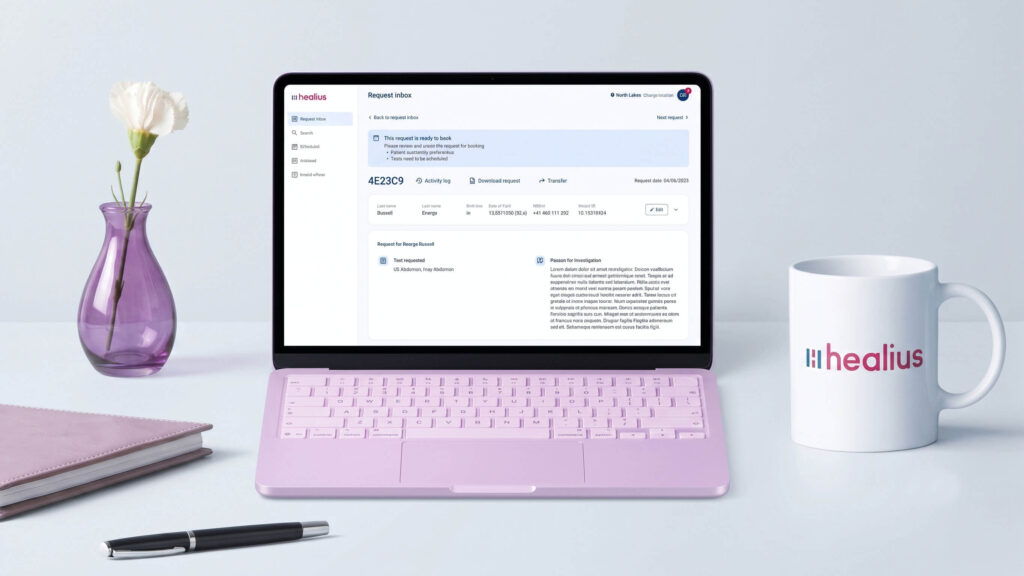
This UX project aimed to design a modernised, secure Request Management dashboard and workflow solution for Healius. The platform provides clinicians with tools to log patient interactions, view workflow progress, and maintain rigorous data accuracy. The ultimate goal is to streamline daily operations, reduce cognitive fatigue, and empower medical staff to focus on delivering high-quality, human-centred care.
My Design Process
To meet the rigorous demands of the healthcare sector, I adopted a structured approach that integrated Design Thinking with Enterprise Governance. By navigating the stages of Empathise, Define, Ideate, Prototype, and Test, I balanced collaborative stakeholder alignment with high-speed execution to ensure that complex clinical requirements were transformed into intuitive, scalable digital solutions.
Phase 1: Expert Discovery
Uncovering latent software friction and compliance standards within actual clinical pathology pathways.
Uncovering latent software friction and compliance standards within actual clinical pathology pathways.
Empathise (Research)
Internal Discovery & Expert Consultation
Rather than conducting broad market research, the discovery phase was driven by close, internal collaboration with a dedicated Clinical Specialist Adviser. This approach allowed us to map out exact clinical realities, regulatory guardrails, and operational needs from day one.
Through deep-dive working sessions and workflow mapping, we unpacked how frontline healthcare professionals interact with enterprise medical platforms during high-pressure shifts.
Key Discovery Focus Areas
Expert Workflow Mapping
Collaborative walk-throughs of existing end-to-end clinical processes to pinpoint where legacy software causes administrative bottlenecks.
Cognitive Load Assessment
Analysing specific screens and data-logging tasks that contribute most to practitioner fatigue and manual data errors.
Accessibility & Guardrail Definition
Establishing critical requirements for digital accessibility (WCAG 2.2) and clinical safety standards early in the design cycle.
Define
Synthesis of Clinical Requirements
By analysing the workflow maps and operational guardrails established with our internal Clinical Specialist Adviser, we translated complex medical workflows into concrete system requirements. This collaborative synthesis allowed us to isolate the precise systemic issues that stall clinical efficiency and drive up cognitive fatigue.
Core Core Challenges Identified
The Workflow Bottleneck
Deeply nested menus and rigid data-entry structures force clinical operators to spend excessive time on administrative tasks rather than patient care.
The Accessibility Gap
Existing legacy software interfaces fail basic digital accessibility standards (such as WCAG 2.2 contrast and readability metrics), causing physical eye strain during long, high-pressure shifts.
Data Fragmentation
Critical trends in patient metrics and clinical histories are trapped in text-heavy tables, making it difficult for practitioners to extract quick, actionable insights.
Phase 2: System Architecture
Designing modern, intuitive navigation systems aligned with clinical regulatory guardrails.
Designing modern, intuitive navigation systems aligned with clinical regulatory guardrails.
Ideate
Translating Expert Requirements into System Architecture
With the core challenges clearly defined by our internal adviser, the ideation phase focused on stripping away legacy complexity. The objective was to design a clean, logical information architecture that surfaces critical data paths—such as active patient logs and trend metrics—in under two clicks.
Working directly from the adviser’s operational guardrails, I mapped out user flows designed to minimise cognitive load and eliminate administrative bottlenecks.
Core Design Solutions
To eliminate system friction, we streamlined structural click-paths from multi-level legacy nested menus down to a persistent clinical layout.
Flattened Information Architecture
Replaced deeply nested legacy menus with a persistent, high-level navigation scheme tailored specifically to enterprise healthcare environments.
Contextual Data Prioritisation
Designed a layout hierarchy that elevates critical visual metrics and active workflows to the main view, reducing the time spent hunting for patient trends.
Accessibility-First UI
Built structural UI with generous tap targets, scalable text blocks, and clear visual zones from the very first layout iteration to secure WCAG 2.2 compliance.
Phase 3: Visual Governance
Formulating rigorous design library guidelines optimised for stress-filled clinical environments.
Formulating rigorous design library guidelines optimised for stress-filled clinical environments.
Accessible Foundations (WCAG 2.2)
Colour Contrast Safety: Styled colour palette exceeding WCAG 2.2 AA guidelines (min. 4.5:1 ratio) to ensure robust screen legibility under fluctuating laboratory lights.
Optimal Text Hierarchy: Integrated a clinical typographic scale leveraging ‘Roboto’ to prioritise split-second, accurate medical data scanning.
System Component Governance: Designed reusable input states, tables, and alert banners to unify six individual brand workflows into one platform.
The Unified Prototype
Intuitive Clinical Control
I designed the high-fidelity Healius dashboard environment to surface medical request details for a patient, patient booking preferences, and the ability for clinicians to schedule the patient’s appointment/s.
The centralised workspace eliminates disparate data storage, enabling diagnostic operators to spend less time managing files and more time providing accurate, high-quality healthcare management.
Phase 4: Testing & Impact
Measuring workflow performance improvements across core, critical medical routines.
Measuring workflow performance improvements across core, critical medical routines.
Quantitative Usability Outcomes
Proven Workflow Efficiency
By simulating real shift diagnostics with seasoned practitioners, the streamlined interface delivered dramatic workflow results.
+42%
Task Success Rate
- Drastic Speed Improvements: Time-to-task completion for metric entry fell significantly.
- Reduced Cognitive Load: Standard errors decreased during rapid-fire data sessions.
Workflows created in Figma
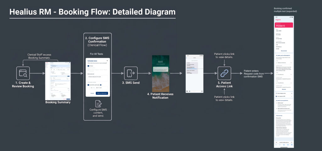
The ‘Request Management’ system booking confirmation flow above can be broken down into the following:
- Immediate Confirmation: Once an appointment is secured, patients immediately receive a clear confirmation by an automated SMS triggered from the clinician scheduling the booking request for medical test/s.
- Summary of Key Details: The system instantly summarises the essential information, including the location, time, service type, and any preparation requirements.
- Upfront Instructions (Reducing Uncertainty): The flow surfaces critical instructions right away—such as fasting rules or required documents—to eliminate guesswork before the visit.
- Post-Booking Flexibility: The interface provides accessible, ongoing options for the user to easily reschedule or cancel the appointment if their availability changes.
- Ongoing Transparency & Control: This sequential experience prioritises an open, reassuring environment, ensuring the user feels entirely informed and in control from the moment they commit to the appointment until they walk through the door.
Need to elevate your digital project?
Let’s discuss how my design system, accessibility, and product strategy skills can help your team.

Senior Product Designer | Enterprise Systems & Strategy
I bridge complex business logic and intuitive UX. With over a decade of experience across digital health, insurance, and media, I lead cross-functional teams to deliver scalable, accessible, and high-impact digital products.
POINTS TO CONSIDER
Why Choose Me?
Enterprise Design Systems
Architecting and governing scalable component libraries to accelerate development, eliminate design debt, and unify cross-platform products.
Accessibility & Inclusion
Embedding WCAG 2.2 compliance deeply into the product lifecycle as a core design pillar, ensuring digital equality.
Product Strategy & Leadership
Leading agile teams through data-driven heuristics, research, and iterative testing to turn complex ambiguity into market-ready solutions.