ketch-Up: Crafting a Warmer, Safer Path to Adult Friendships
End-to-End Application
Enterprise Platform
Business Type – Community nonprofit – Aug-Oct 2025
Highlight Overview
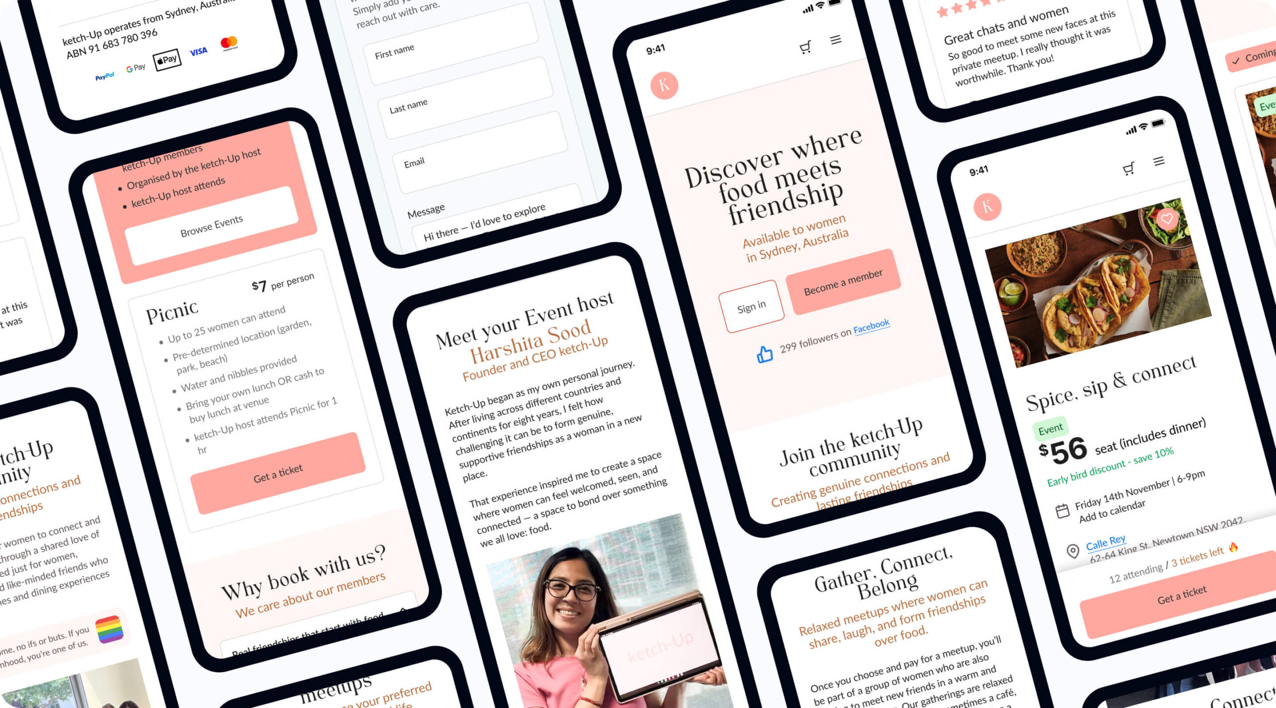
ketch-Up is a community platform that helps women build real, lasting friendships through small, intentional in-person meetups. Interest in the community was strong, but most first-time visitors hesitated at the final step — they browsed, but didn’t register to attend meetups. Through user interviews, a heuristic review, and an analytics audit, I traced the drop-off to two root causes: the homepage didn’t clearly explain what ketch-Up was or who it was for, and the meetup pages didn’t give women the confidence or practical detail they needed to commit to showing up in person.
I redesigned the homepage and meetup flow around one goal: turn passive curiosity into confident registration. That meant rebuilding the mobile experience with instant clarity, visible trust signals (real host profiles, transparent pricing, peer reviews), and a low-pressure, small-group framing that competitors weren’t offering. I validated the direction with an unmoderated usability test of 22 participants before hand over to the client.
Impact
Test participants reported feeling significantly safer and more informed after the redesign, and I caught and fixed a checkout bug before it reached production.
The Challenge
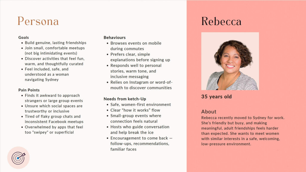
I found out through direct user interviews that when women arrive at ketch-Up, they’re quietly asking themselves two things: “Is this real?” and “Will I feel safe here?” If the site doesn’t answer both fast, they leave.
Research (see Method below) surfaced two core problems:
- Lack of clarity — the platform wasn’t explaining what ketch-Up is or who it’s for.
- Friction on meetup pages — event pages weren’t giving women enough confidence or detail to convert interest into attendance.


My Role & Method
Role: UX + UI Design, User Research, Information Architecture, Interaction Design, Prototyping & Usability Testing
Tools: Lyssna, FigJam, Figma
To ground the redesign in evidence rather than assumption, I ran:
- Participant interviews — semi-structured, recorded sessions with women in the target demographic, covering past event behaviour, introvert/extrovert dynamics, and what builds (or breaks) trust on a website.
- Heuristic evaluation — a structured usability audit of the existing site.
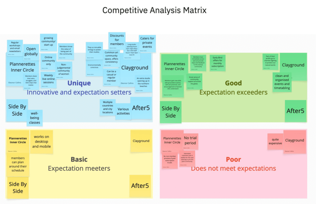
- Competitor analysis — a comparison matrix across four direct alternatives (Plannerettes Inner Circle, Clayground, Side By Side, After5) on utility, pricing, tone, and entry friction.
- Analytics review — traffic and drop-off data, plus a WebAIM contrast check that flagged the homepage’s coral-on-white text at a failing 1.83:1 contrast ratio.
What I Found
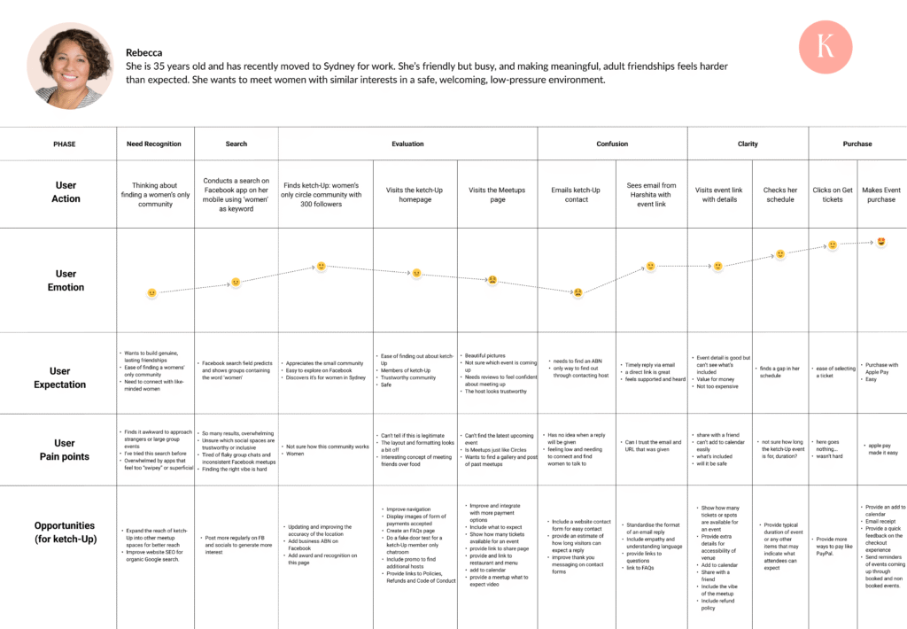
- The “vibe” gap(interviews) — women wanted to know who’d be there and what the atmosphere was like before committing.
- Buried details(heuristic evaluation) — practical logistics were hard to find, adding decision fatigue.
- The trust gap(interviews + competitor analysis) — visitors needed concrete legitimacy signals: real photos, host profiles, reviews.
- Accessibility risk(WebAIM audit) — failing text contrast was actively hurting readability.
- Mobile drop-off(analytics) — strong social-driven mobile traffic wasn’t converting, because the mobile layout wasn’t optimised for it.
- Market gap(competitor analysis) — competitors leaned generic and transactional; nobody owned “small, guided, intentional meetups.”
The Solution
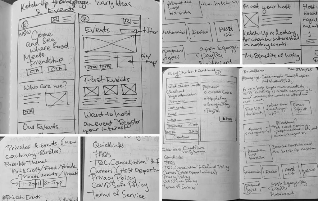
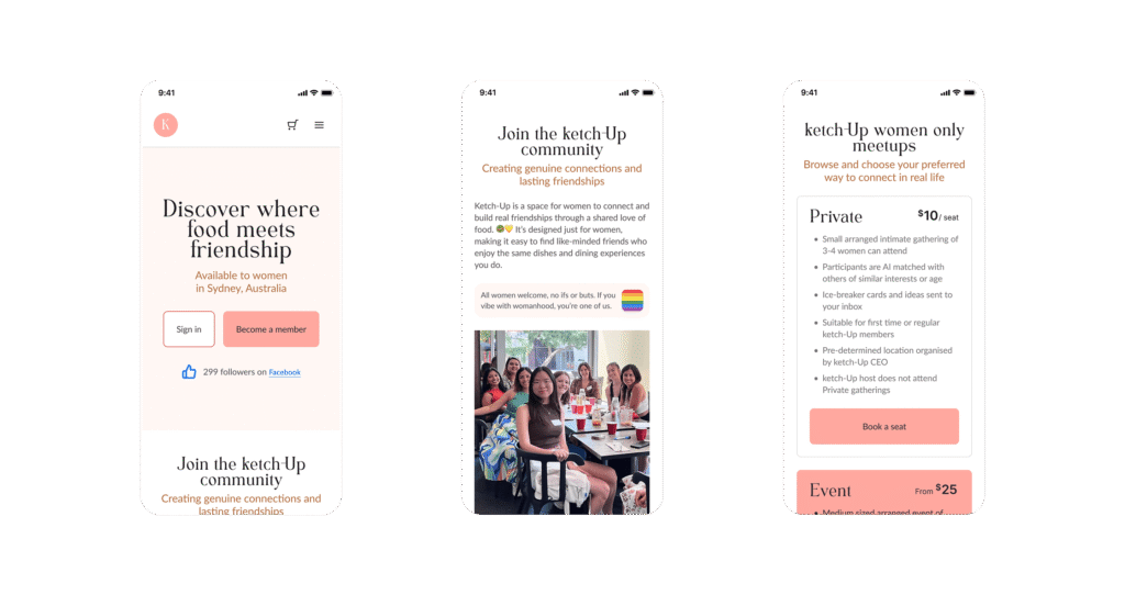
- Clearer & warmer homepage — replaced sterile layout with human storytelling that reflects the community’s actual tone, and made the value proposition legible within seconds of landing.
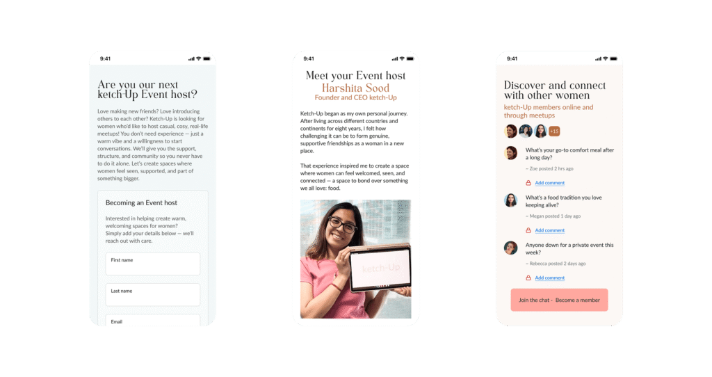
- Trust built structurally, not decoratively — real peer reviews, transparent pricing, detailed host profiles, and visible safety/legitimacy info (ABN, cancellation policy, verification badges) directly answer the “is this real?” question from research.
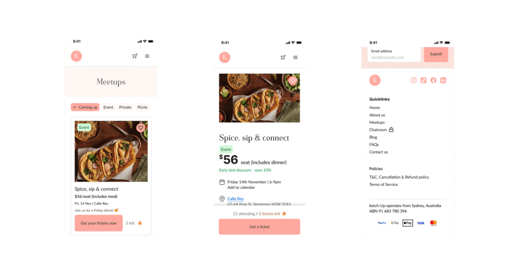
- Meetup pages redesigned for confidence — real host profiles, live seat trackers, and a clear “what to expect” section replace vague listings.
- Mobile-first rebuild — sticky CTA, simplified checkout (only essential fields), and upfront pricing removed the friction causing mobile drop-off.
- Validated, not assumed — an unmoderated Lyssna test with 22 participants confirmed the redesign improved clarity and emotional reassurance, and surfaced a checkout bug I fixed before the next testing round.

Outcome
This was the first of three UX Harness Projects, where I delivered a full presentation and design file directly to the ketch-Up client.
Stakeholder involvement, from the start
Rather than designing in isolation, I checked in regularly with my course mentor throughout the project — sense-checking research direction and key decisions before committing to high-fidelity screens, so the final presentation held up to outside scrutiny rather than just my own assumptions.
Grounded in real user voice
Every major decision — from the trust signals on the homepage to the “what to expect” section on meetup pages — traced back to something a participant actually said in interviews or testing, not an assumption.
Resourceful, not resource-heavy
I made deliberate use of low-cost research tools — Lyssna for unmoderated testing, FigJam for synthesis — to validate direction quickly within a tight project timeline, rather than requiring a large research budget to get credible signal.
Beyond this redesign, I also scoped a low-cost way to validate demand for a future community chat feature before any engineering investment — happy to walk through that in a conversation.
Need to elevate your digital project?
Let’s discuss how my design system, accessibility, and product strategy skills can help your team.