ketch-Up: Intentional Friendship Meetups
End-to-End Application
Enterprise Platform
Project Overview
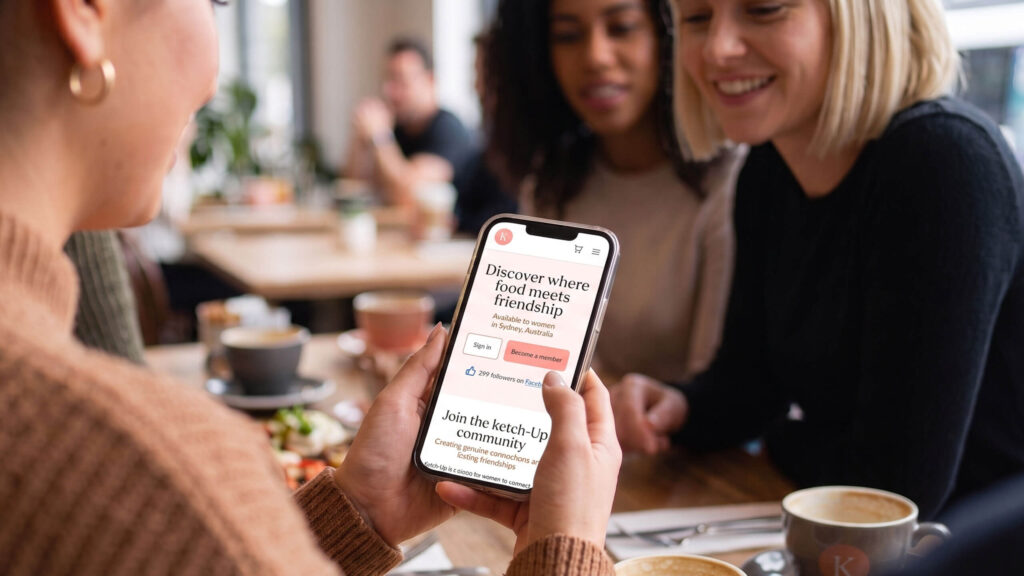
ketch-Up is a community platform purposefully built to help women form genuine, lasting adult friendships. As the UX/UI Designer, my focus was on modernising the platform’s core digital entry points—the homepage and meetup pages.
This project was about much more than a visual refresh; it required a deep, human-centred approach to establish clarity, foster trust, and alleviate the underlying emotional anxieties that women naturally feel when putting themselves out there to make new connections.
Timeframe
August-October 2025
My Role
UX + UI Design, User Research, Information Architecture, Interaction Design, Prototyping & Usability Testing
Tools
Lyssna, FigJam, Figma
The Challenge
Overcoming the emotional hurdles of adult connection
Front-end traffic analytics revealed a clear disconnect: while social media marketing successfully drove a high volume of mobile visitors to the platform, bounce rates were high and conversion rates remained low.
User discovery revealed that when first-time visitors arrived, they were immediately met with two unaddressed emotional hurdles: “Is this platform real?” and “Will I feel safe here?” Due to practical event logistics being buried, meetup vibes were unclear, and trust signals were absent. Interested users routinely hesitated and dropped off before converting.
Objective/Goal
The goal of this project was to completely restructure the mobile platform experience to:
- Clearly and instantly articulate what ketch-Up is, who it is for, and how it works.
- Optimise the end-to-end meetup discovery and registration flow, turning passive user interest into confident, real-world attendance.
My Design Process
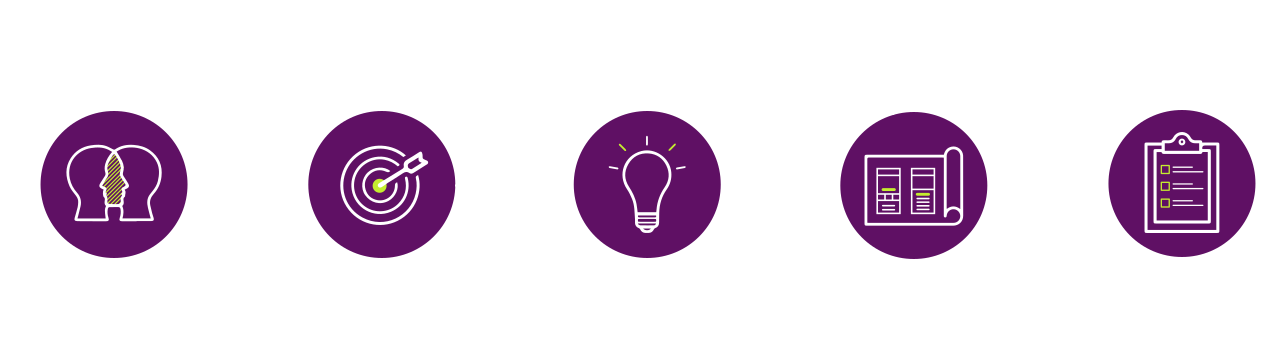
To address both the operational friction and the sensitive emotional landscape of this space, I utilised a structured, lightweight Design Thinking framework. Navigating through Empathise, Define, Ideate, Prototype, and Test allowed me to remain highly adaptive while keeping user psychology at the center of every layout decision.
Phase 1: User Discovery & Analysis (Empathise)
Uncovering latent friction through mixed-method research
Uncovering latent friction through mixed-method research
To identify exactly where the digital experience was failing first-time visitors, I deployed a multi-layered research methodology combining quantitative data with qualitative emotional insights:
Key Discovery Focus Areas
Participant Interviews
Conducted deep-dive sessions with target users to capture the emotional context behind platform drop-offs. Users explicitly reported feeling anxious about event sizes, hidden checkout fees, and a lack of transparency regarding who would be in attendance.
Heuristic Evaluation
From a UX perspective, the most impactful opportunities center on reducing user effort and accelerating decision-making. This can be achieved by improving the mobile layout, strengthening trust signals, and clarifying meetup types, while also ensuring both the homepage and meetup pages are highly scannable with clear, consistent calls to action.
Competitor Analysis
Evaluated broad, generic meetup platforms. Competitors tend to be broad or generic — large meetup platforms without much emotional tone or intentionality. A clear opportunity: positioning ketch-Up as the place for small, guided, intentional meetups Differentiation through warmth, structure, and trust.
Analytics Review
Despite strong traffic driven primarily by social media, low retention and conversion rates indicate that the desktop and mobile experiences are failing to meet user expectations upon arrival. To capture this high initial interest, the platform must better address user needs and improve performance, particularly on mobile devices where the majority of traffic originates.
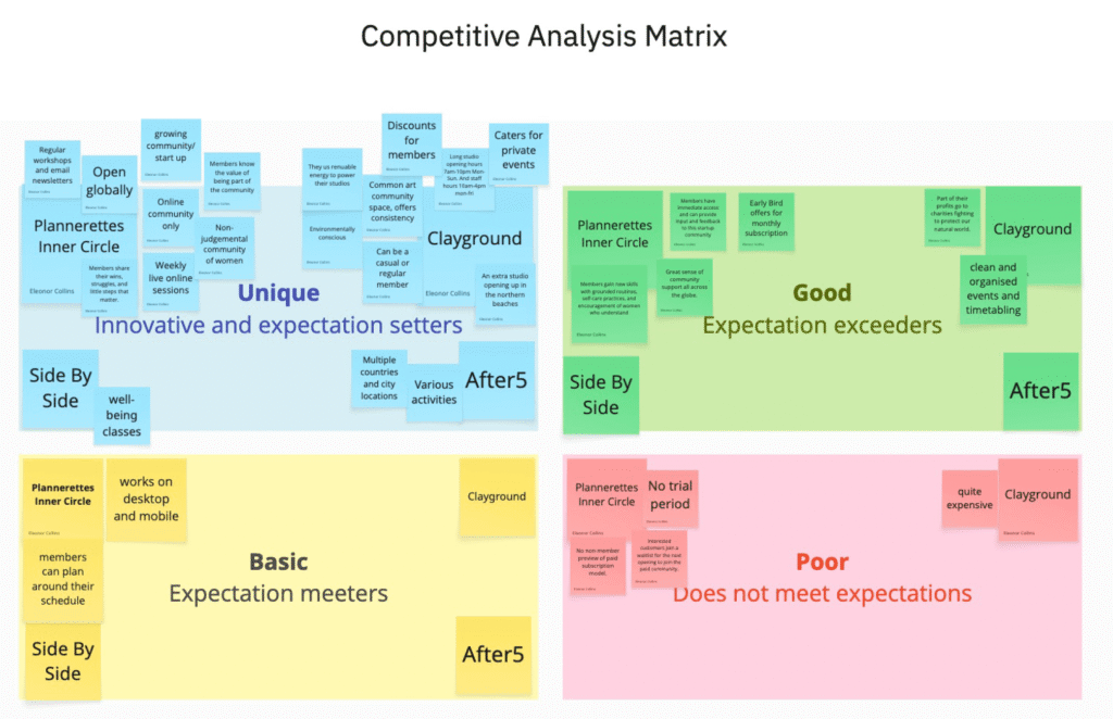
Above: Competitive Analysis Matrix
The four competitors that were analysed were Plannerettes Inner Circle, Clayground, After5, Side By Side.
Key Takeaways
All groups had some sort of unique product offering for customers. The most meaningful groups provided a broad set of activities, support, and resources.
Notable finds
The meetups that were run with facilitators or hosts tended to be offered quite well but also quite inconsistent. Side by Side didn’t provide a predictable schedule of when their meetups would be, or when the next one is likely to happen. Clayground on the other hand were so popular most of their classes were only available by joining a waitlist, which is not a very good user experience if you’re keen to get started on your preferred date and time.
Phase 2: Synthesis & Framing (Define)
Defining problem frameworks and user persona
Defining problem frameworks and user persona
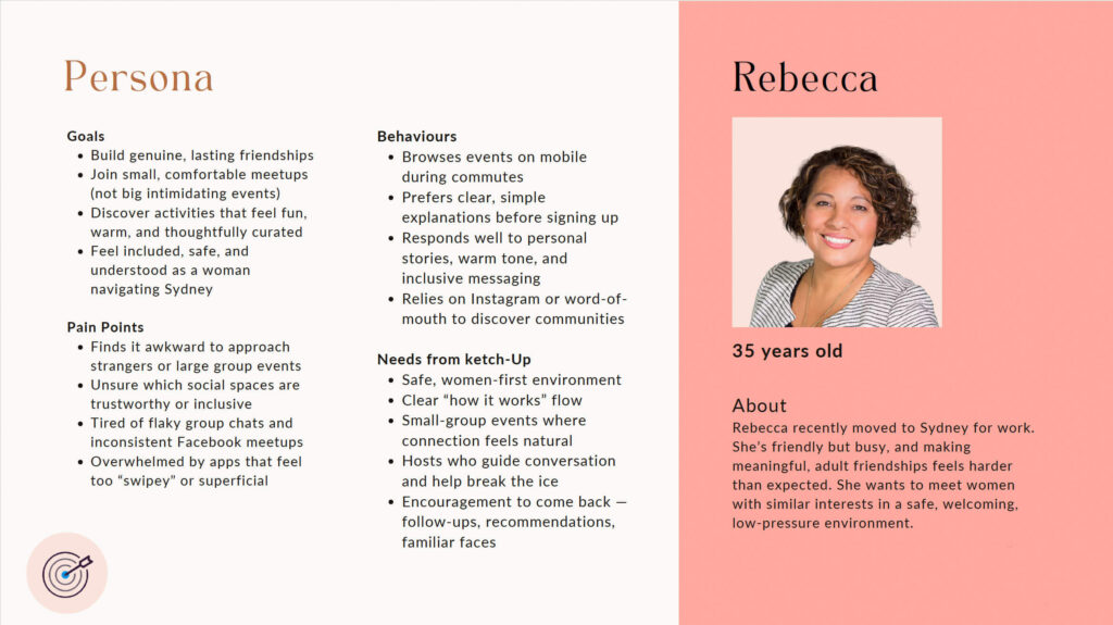
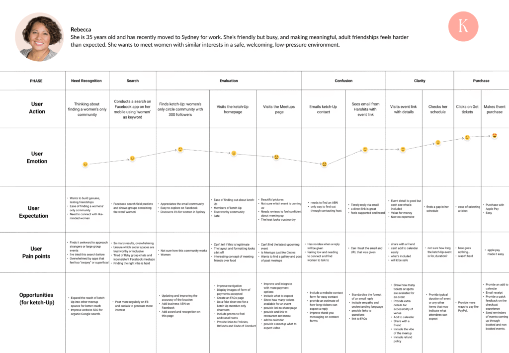
To translate these diverse research inputs into an actionable blueprint, I synthesised my findings into two core pillars: target user mapping and strategic problem reframing.
Strategic “How Might We” Frameworks
I reframed our core structural challenges into two targeted, actionable problem statements:
- How might we help women instantly understand what ketch-Up is and why it matters the moment they land on the page?
- How might we make our meetup details feel warm, completely transparent, and low-pressure so women feel secure enough to attend?
Across all synthesis, four critical architectural themes emerged to guide our design iterations:

Journey Phases
- Need Recognition & Search: Rebecca feels the urge to connect with a women-only community. She searches Facebook using the keyword “women” and discovers the “ketch-Up” community. While happy to find a small group, she initially feels overwhelmed by the volume of search results and flaky alternatives on social media.
- Evaluation: She visits the ketch-Up homepage and Meetups page. While she appreciates the concept of meeting over food, her emotional state dips due to confusion over event dates, a somewhat “off” layout, and a lack of clear legitimacy signals (like an ABN or past meetup galleries).
- Confusion: Rebecca reaches out via email because she cannot find specific event details or a business ABN. Her mood hits a low point here as she feels lonely, disconnected, and uncertain of when she will receive a reply.
- Clarity: Her experience rebounds positively when she receives a timely, supportive email from Harshita containing a direct event link. After checking her schedule and reviewing the details, her trust is restored, though she still wishes for minor clarifications like event duration and safety details.
- Purchase: The journey ends on a high note. Rebecca finds the ticketing and checkout process easy, ultimately making a successful event purchase using Apple Pay.
Phase 3: System Architecture & Low-Fi Layouts (Ideate)
Stripping away cognitive load through rapid ideation
Stripping away cognitive load through rapid ideation
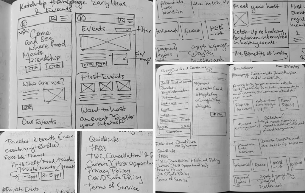
With a clear focus on reducing user anxiety, I moved into rapid concept sketching and notebook layout ideation.
Redefining the offering: Analysed the current product structure and adapted to suit a broader selection of experiences and sizes.
Designing for Radical Transparency: Sketched out dedicated UI modules for meetup pages that immediately elevated the exact ticket pricing structures, specific payment options (Apple Pay, Google Pay, PayPal), and real-time remaining ticket counts.
Humanising the Event Vibe: Prioritised human faces and social proof by drafting prominent “Meet Your Host” introduction cards, host experience portfolios, and verified past participant testimonials.
Phase 4: High-Fidelity UI Design & Prototyping (Prototype)
Crafting a warm, mobile-first ecosystem
Crafting a warm, mobile-first ecosystem
The high-fidelity mobile first design brought infused real human warmth into a modern, accessible interface design featuring:
- Warm Landing Page: Restructured the mobile heroes to feature a transparent, welcoming and become a member, “Meet our host”, easy expression of interest host form, and types of meetups.
- Chatroom “Fake Door” Test: This test aims to gauge user interest in a potential chat feature. When a user clicks the chat CTA, they will see a message thanking them for their interest and explaining that ketch-Up is evaluating the feature based on demand.
- Reassuring Meetup Hub: Transformed text-heavy event details into a scannable, component-driven layout. The interface explicitly categorises meetup types, displays clear group sizes, showcases dedicated host profiles, and incorporates gentle post-event social features to pave the way for repeat attendance.
- Mobile-Optimised Interactions: Designed specifically for the on-the-commute browser, featuring large, generous tap targets, clear visual card zones, ticket remaining counter with icon, and persistent sticky registration actions that vastly reduce checkout friction.
Phase 5: Usability Testing & Operational Impact (Test)
Validating emotional comfort and fixing system flaws
Validating emotional comfort and fixing system flaws
To rigorously measure the effectiveness of the updated designs, I launched a remote, unmoderated prototype usability study with 22 target participants utilising Lyssna. View
Key Testing Outcomes:
- Rapid Value Comprehension: 91% of participants effortlessly articulated the platform’s core value proposition and small-group focus within seconds of exposure.
- Elevated Emotional Comfort: Users verified that the visible host profiles, upfront group sizing indicators, and integrated safety cues made them feel welcome, safe, and significantly more confident about attending an event alone.
- Early Technical Bug Detection: During the testing process, it was identified that the Figma live prototype had issues with a sticky add to cart button which was a Figma programming bug. I was able to identify this after 2 testers observed in real time mentioned they couldn’t see any CTA to add a meetup to their cart.
Unfortunately this bug was the main reason behind users not being able to complete the checkout process in the initial testing phase. To get around this, I embedded the add to cart button into the flow of the page just for testing purposes.
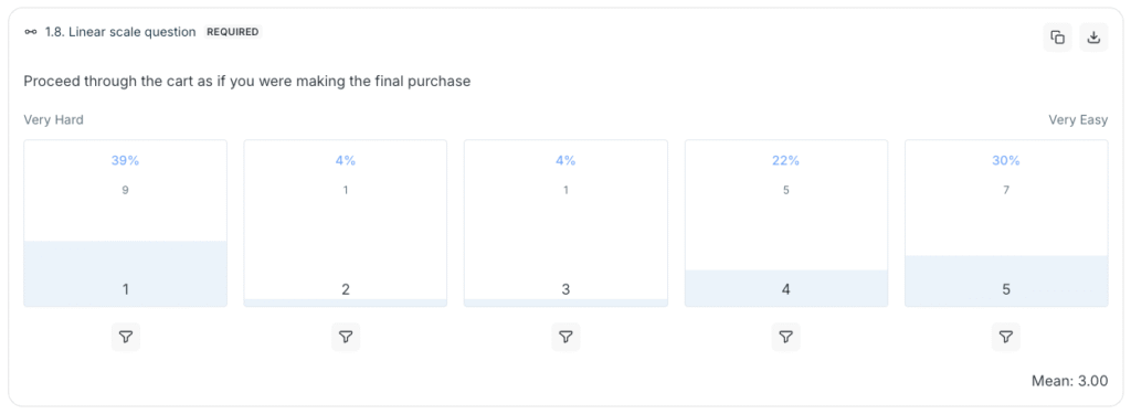
Above: Lyssna user testing identified the add to cart issue with 9 users specifying Very Hard to complete purchase.
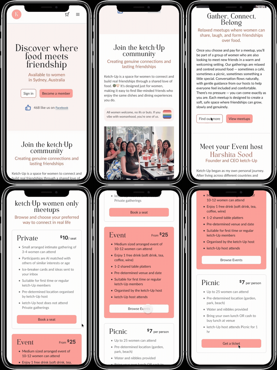
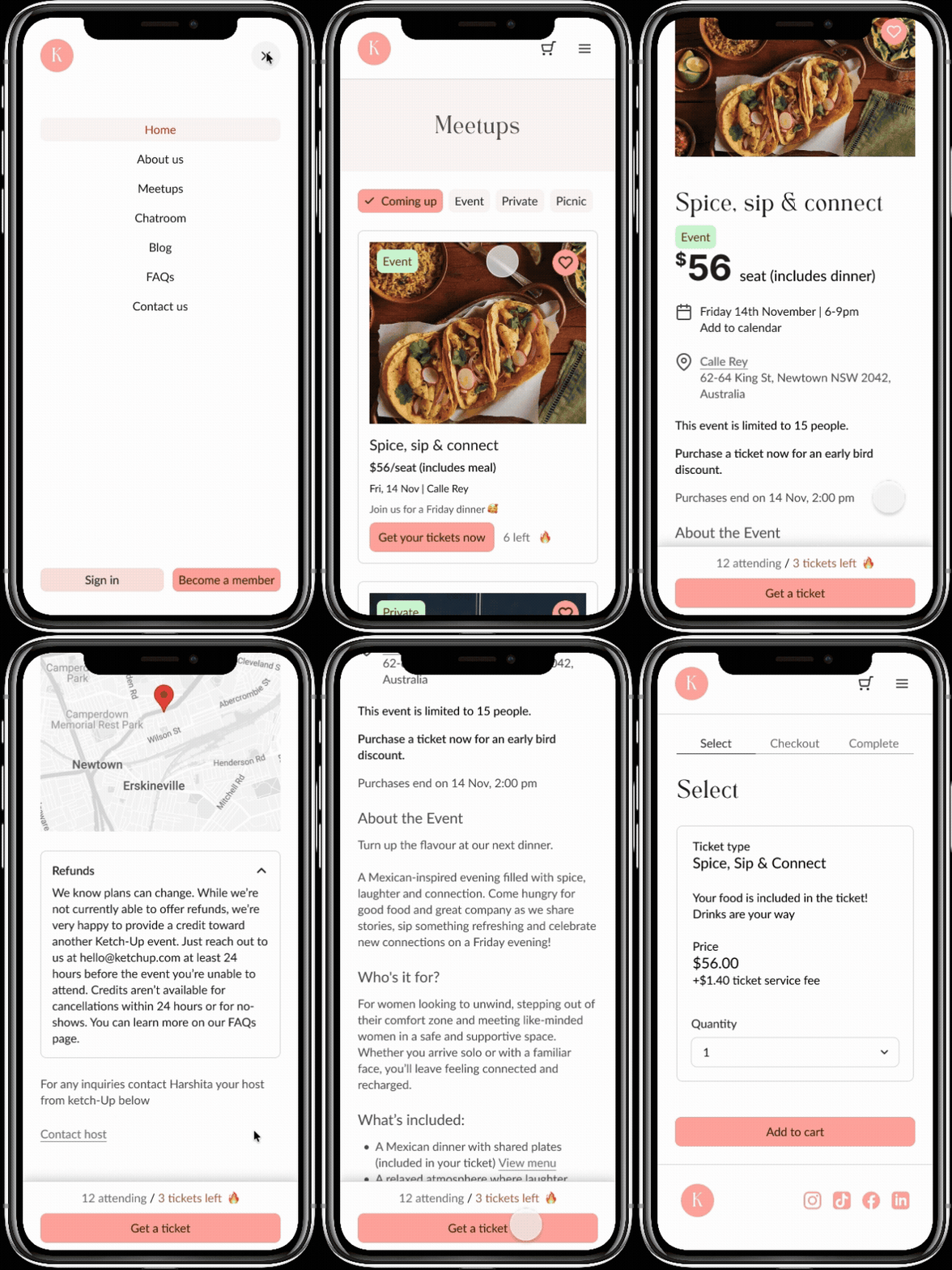
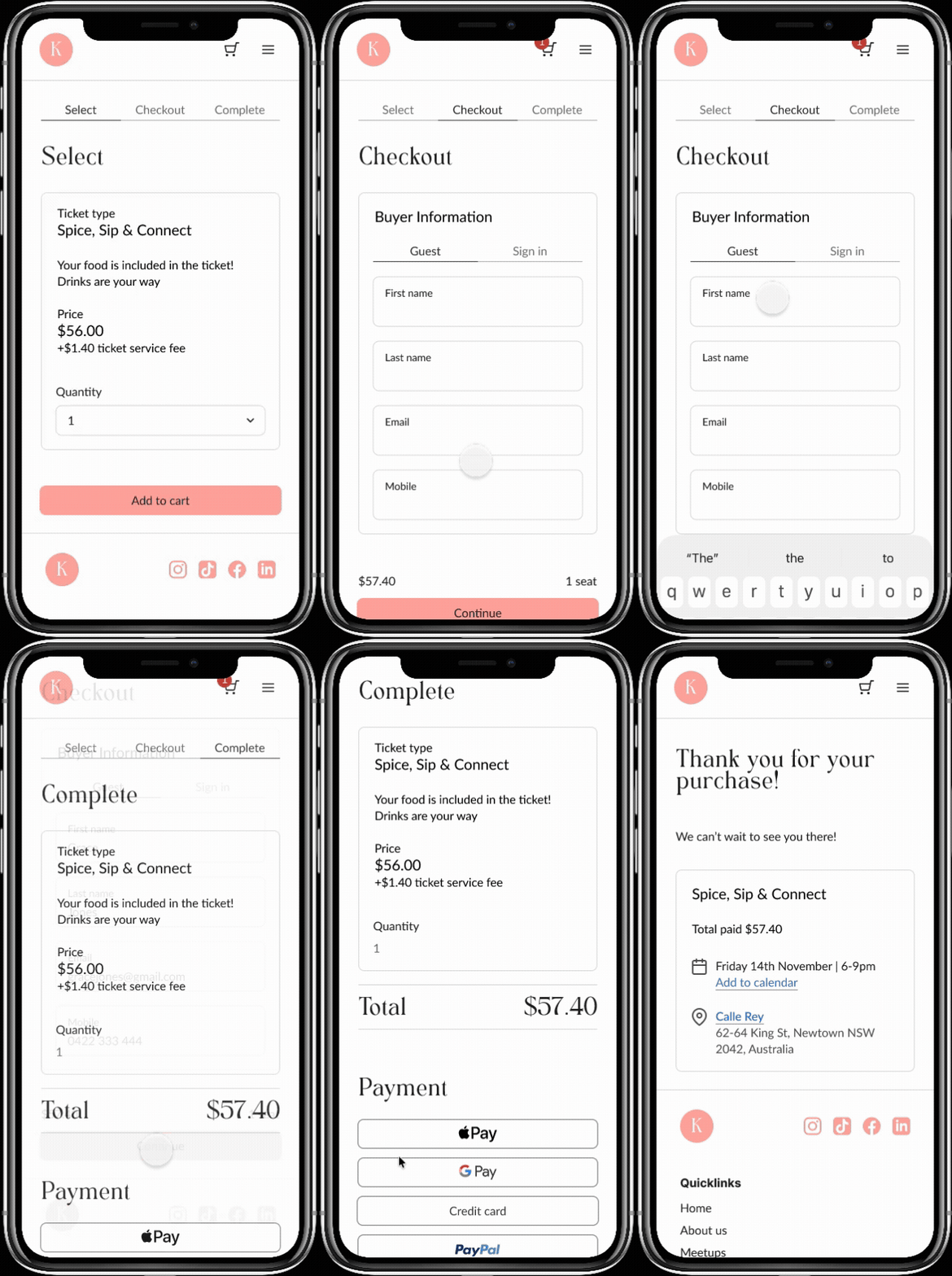
Above: Snippets of the first prototype created for testing
Animated Prototypes
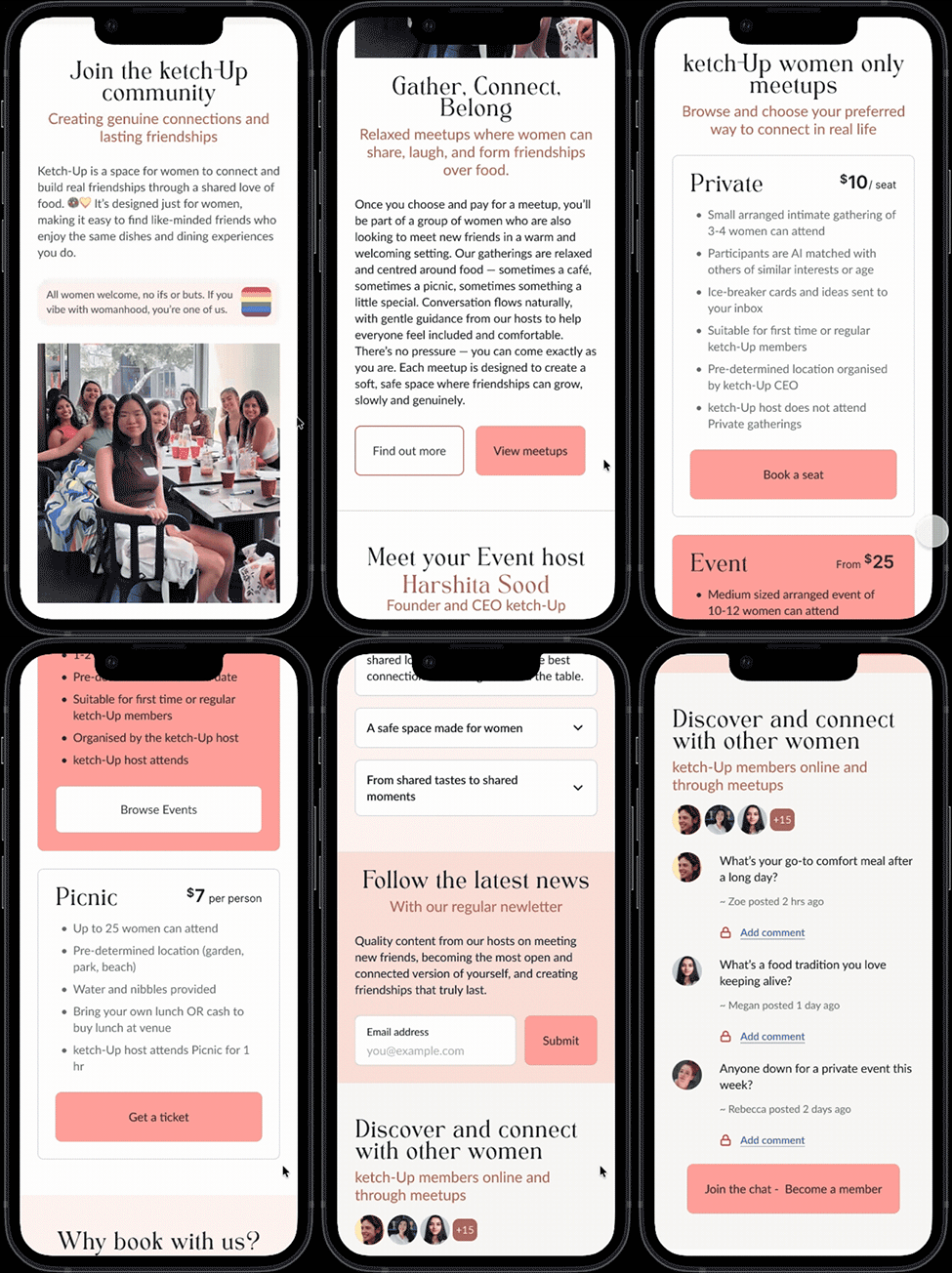
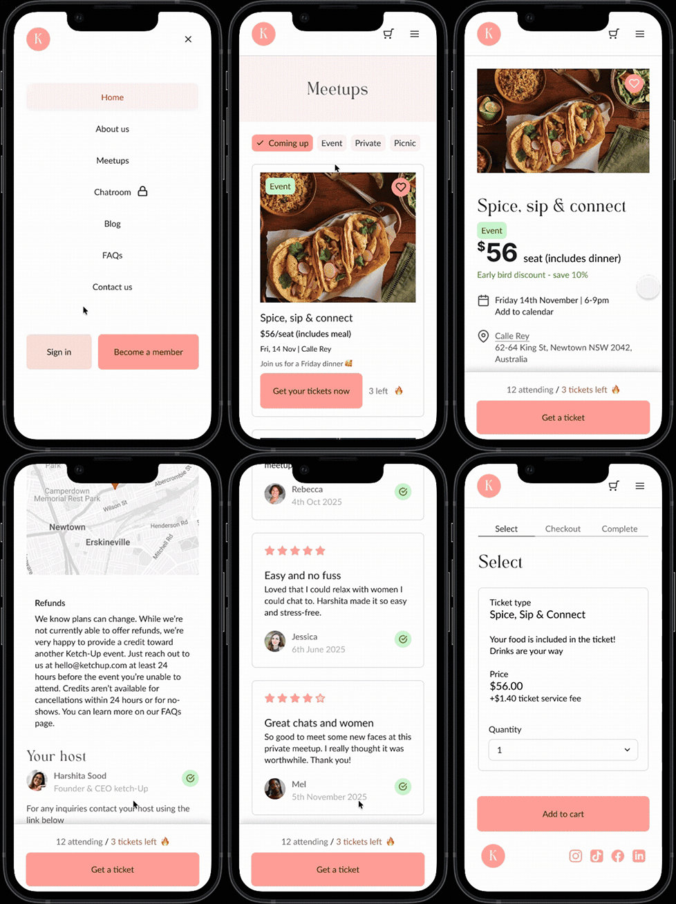
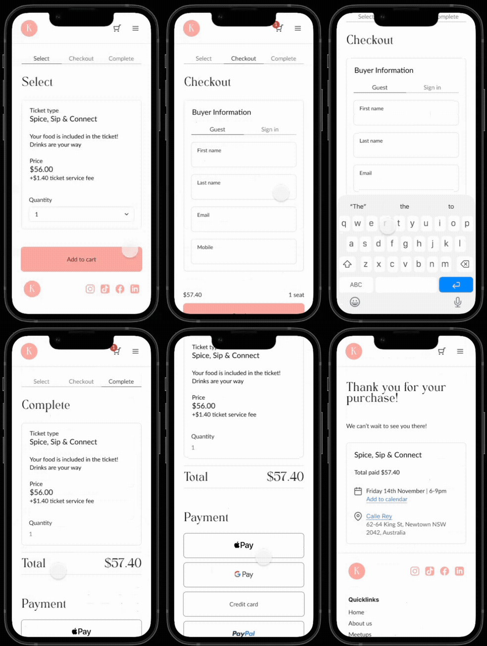
The animated prototypes above show snippets of the final prototype which include the homepage, meetup page, and checkout purchase experience.
Need to elevate your digital project?
Let’s discuss how my design system, accessibility, and product strategy skills can help your team.

Senior Product Designer | Enterprise Systems & Strategy
I bridge complex business logic and intuitive UX. With over a decade of experience across digital health, insurance, and media, I lead cross-functional teams to deliver scalable, accessible, and high-impact digital products.
POINTS TO CONSIDER
Why Choose Me?
Enterprise Design Systems
Architecting and governing scalable component libraries to accelerate development, eliminate design debt, and unify cross-platform products.
Accessibility & Inclusion
Embedding WCAG 2.2 compliance deeply into the product lifecycle as a core design pillar, ensuring digital equality.
Product Strategy & Leadership
Leading agile teams through data-driven heuristics, research, and iterative testing to turn complex ambiguity into market-ready solutions.